London's Originals
A new positioning and visual identity for one of London’s oldest hospitality businesses.
Part of the Compass Group, Payne & Gunter has an unrivalled reputation as one of the country’s most respected special event caterers.
In a crowded and highly competitive sector, the challenge was to create a compelling brand positioning and distinctive visual identity that differentiates the business from its competitors.
Despite their reputation for excellence delivering hospitality at historic palaces and galleries, and entertaining at some of the most exciting outdoor events in the UK, the Payne & Gunter brand had grown to be generic and was not distinctive.
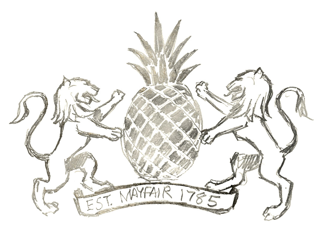
Digging into their historical journey uncovered many interesting and valuable assets and stories. The legacy began as early as 1786 in London’s Mayfair as a society caterer and gelateria, who enjoyed no less than three royal warrants from George IV, V and Napoleon III, and boasted high profile commissions including Queen Victoria’s granddaughters wedding cake.
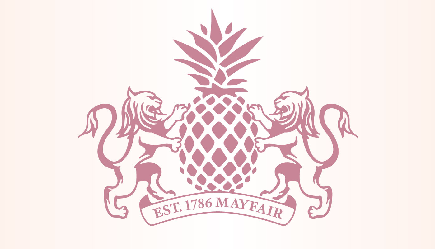
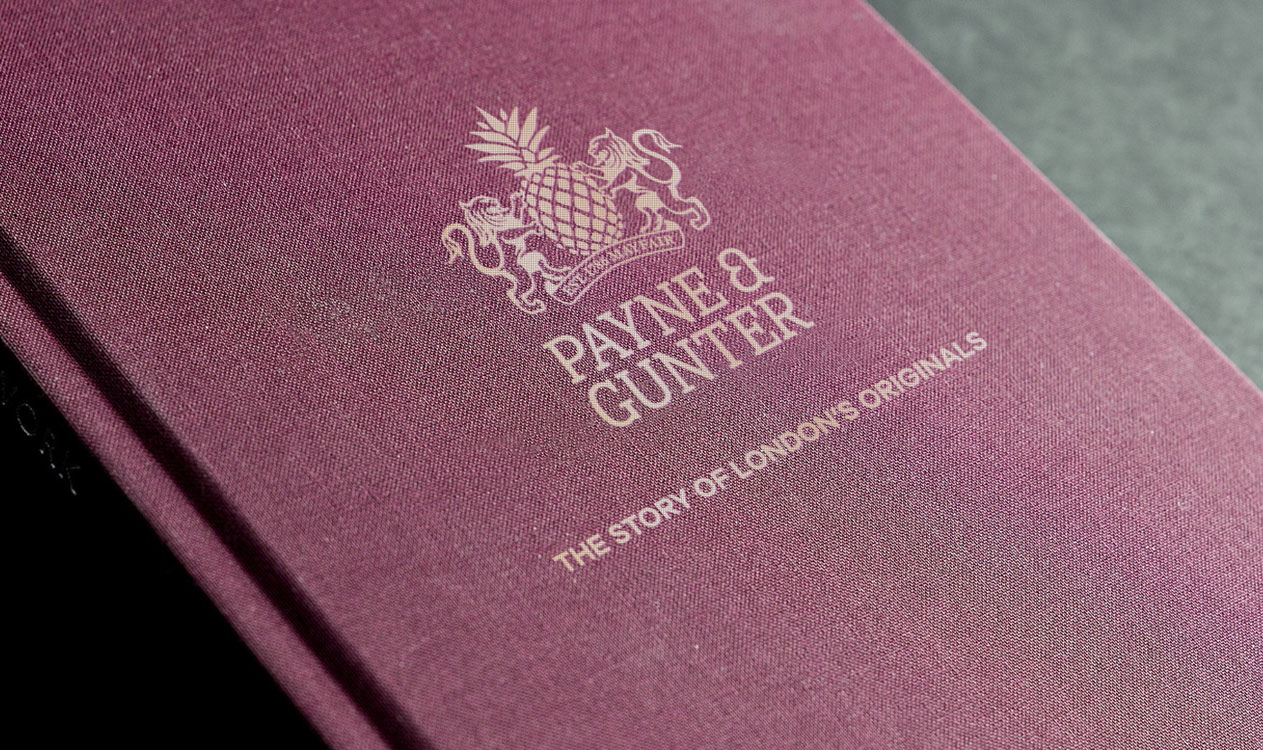
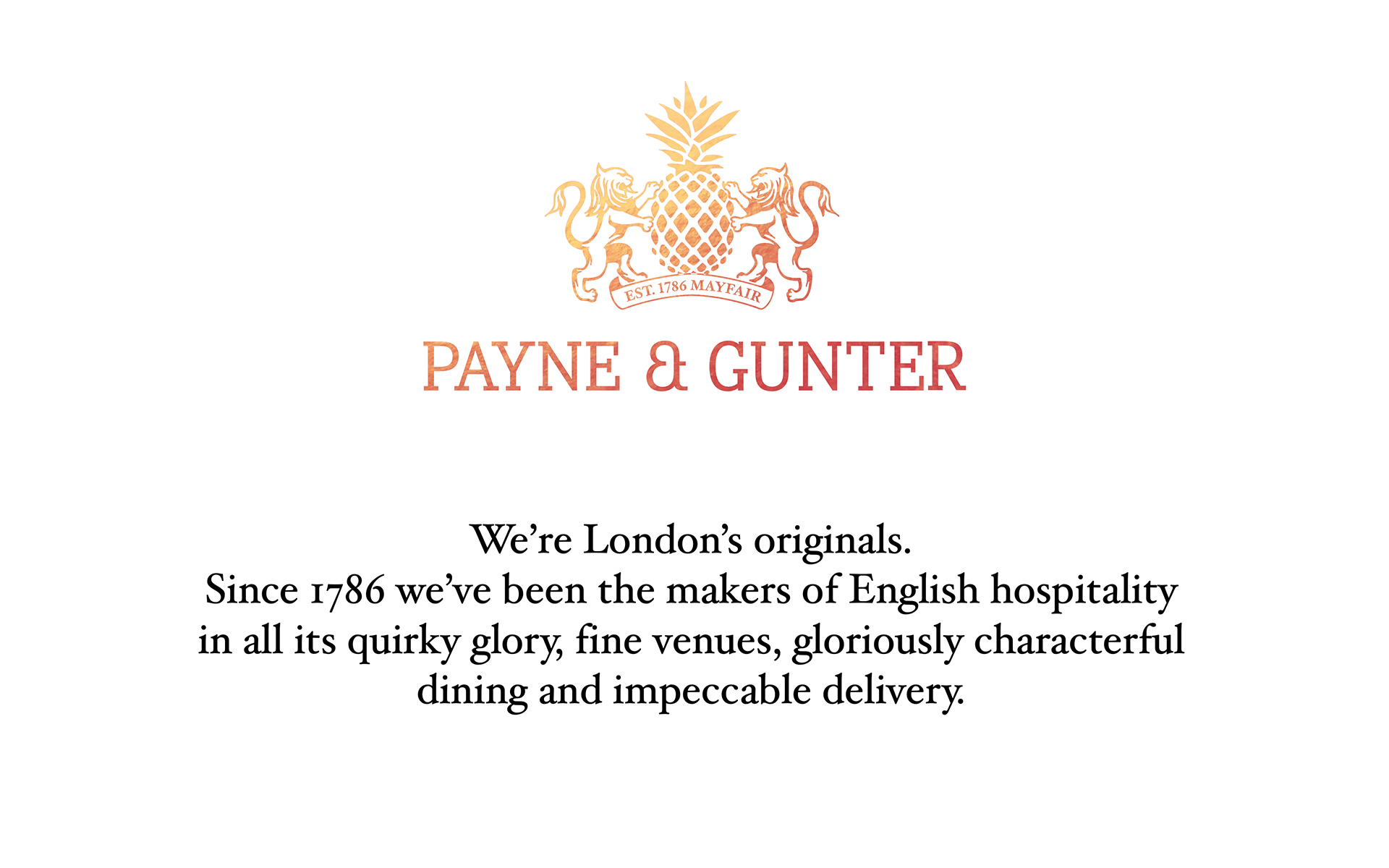
This historic legacy had all but vanished by 2016, so it seemed right to celebrate that which no other competitor could boast. We created a new positioning – “London’s Originals” – this captures both the authenticity and spirit of the business.
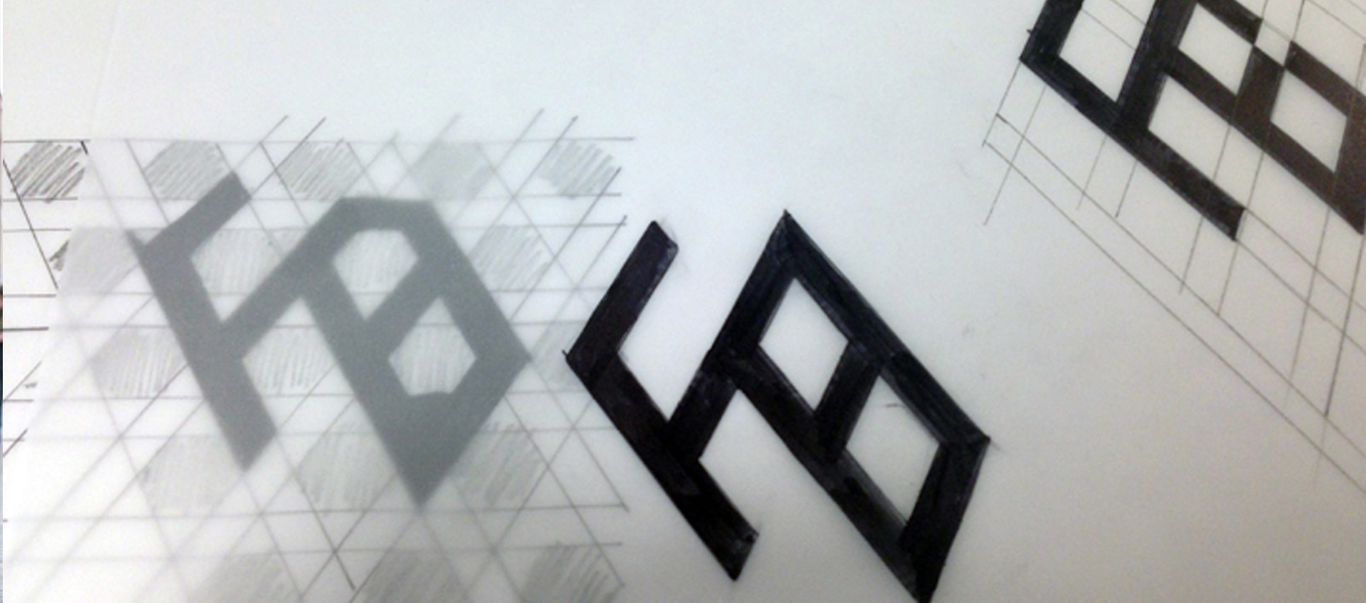
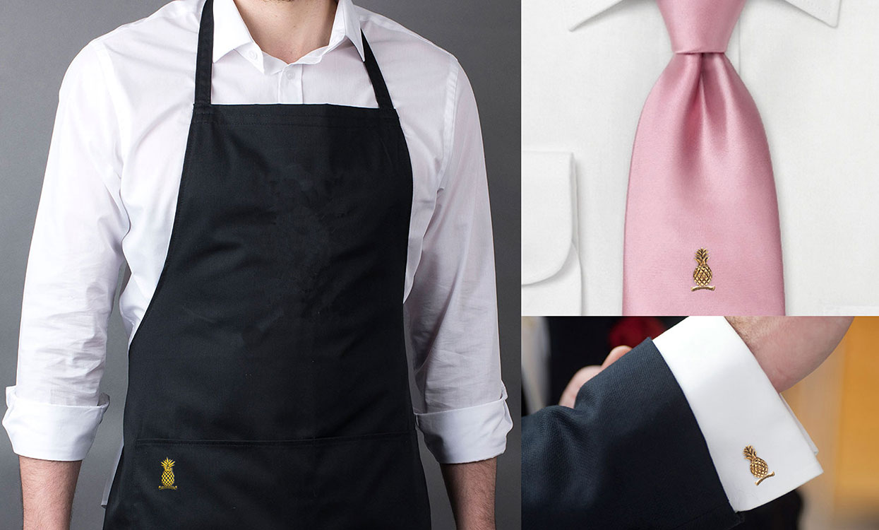
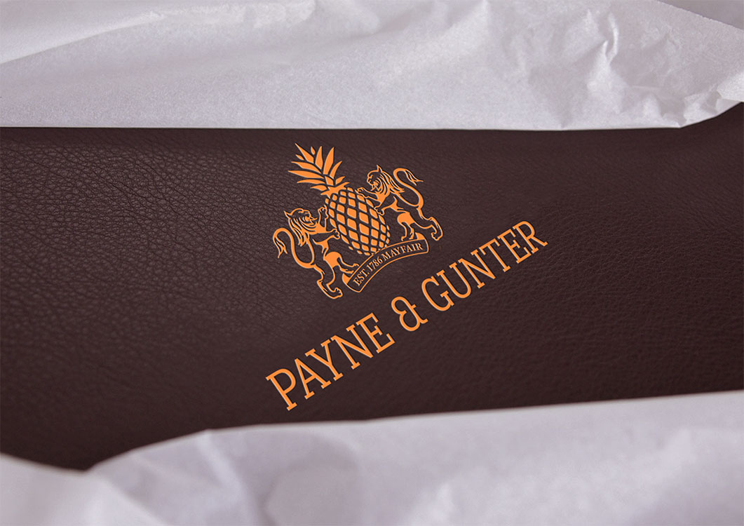
The new brand mark is a recreation of a long lost symbol last seen in the 19th Century when the pineapple motif represented welcome, friendship, and hospitality. Representations of pineapples can be found all over London in architectural detail, ironwork, and even old door knockers. Once you begin to look for them, you won’t stop finding them!
I’m proud to have worked with my late father on this one – he drew the new motif.
Client: Compass Group